Wednesday, May 11, 2011

Art Deco Poster

 I made an art deco poster for New York City.  First I took the picture of the city and cut out the kid. I then used the picture as the background for the poster.  Then I placed the 'New York' banner on the top of my skyline picture.  After I had that in, I matched the color from the New York banner to the picture of New York to give it an art deco look.  After I had it looking like an art deco poster, I placed the people along the walkway.
I only used the 'New York part of this picture


 This is the tutorial I did.  This is a vintage-looking poster that is supposed to be about world war 2.  I thought it was a good idea to have some experience with a vintage poster for this project.  I think this tutorial helped me understand effects better in photoshop and helped me to make my art deco travel poster.
http://gungurru.com/blog/tutorials/create-a-retro-vintage-wwii-style-poster-a-photoshop-tutorial/#more-357

Wednesday, April 13, 2011

Fantasy Poster 1


I started this project with a picture of an ocean and then a separate picture of the sky.  Then I added in the castle.  Then I cropped out the bottom of the castle and placed it on the water to make it look like it is  floating on the water.  Then I changed the color using the color balance tool and also the gradient.  I darkened every object in this poster project.  After all that was done, I added the boat and made it look like it was sinking in front of the castle.  Then I put the finishing touches on and that was it.   


This is the tutorial website I used
This is the tutorial that I did preceding the fantasy poster.  This tutorial was essential to my project because it taught me how to use the color balance and how to darken and lighten colors.  It also taught me how to get rid of unwanted pieces in a picture. I chose this tutorial because it was similar to what I wanted to do for my project so it was almost like a warm up for my real project.

Monday, February 14, 2011

My Logos


This is my symbol logo.  I used the symbol for the University of Alabama because they are my favorite college.  I think the symbol fits in well my name as an O.  I love the way this symbol fits into the name.


I think this name logo looks good because it is different than a normal logo. I like that it is different and innovative.  The way the B's connect is my favorite part


My initials logo is my favorite.  I like the way the white and black contrast each other.  I also like the ways the B's intersect. 

Wednesday, December 8, 2010

Project description:  This project was challenging at first, as it took a while to get used to making all the ligatures and foreground reversals.   The letter replacements were the easiest part in this project and the foreground reversals were the hardest part.  We learned stack text first, then foreground reversals, next we did ligatures and finally we did letter replacement.

In this project I learned how to stack text and create ligatures.  I learned to use more tools in illustrator as well, which will help me later on when we are using illustrator.  Like creating outlines on text and the live trace button.  We did not use the pen or pencil tool for this project.  Instead we used the live trace.

Overall, I think my project came out good.  It looks like a solid finished project.  Also, I completed all of the necessary requirements needed for this project.  One thing I could have done better is the letters that I replaced could have looked more the real letters.    8/8

Friday, November 12, 2010

illustrator week 2 scrapsheet

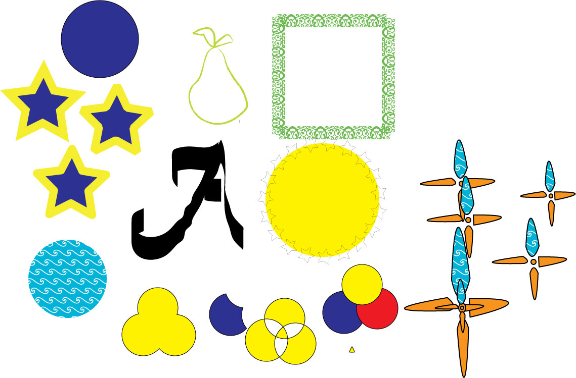
This scrap sheet was a little more challenging than the first scrap sheet.  I think now, though having experience  with illustrator, it helped me a lot allowing me to find my way to make all of these objects.  I think the hardest part was making the flowers because they were so awkwardly shaped.  I liked making the circles and using the pathfinder.  I think i did a fairly good job on this scrap sheet and I hope to improve in the future.